'Alignment': A Key Design Principle in Graphic Design
This video explores the design principle of alignment in graphic design and its impact on composition, emphasizing the use of grids.
00:00:00 This video discusses the design principle of alignment in graphic design and its importance in creating well-designed work.
🖌️ Graphic design is not just about making things look good; there are rules called the principles of design that separate good design from bad design.
🔑 The key principles of design are contrast, hierarchy, alignment, balance, proximity, repetition, simplicity, and function.
📚 Having a good grasp of design theory ensures there is substance behind your work in graphic design.
00:01:15 This video explains alignment as a design principle in graphic design. Alignment helps organize elements, create balance, and connect elements.
⭐ Alignment is a key design principle in graphic design.
🔀 Alignment is used to organize, group, and create balance in design.
🖼️ There are two alignment principles: edge alignment and center alignment.
00:02:24 Alignment is an important design principle in graphic design. It can create a clear and trustworthy composition, while avoiding arbitrary decisions. Good alignment is invisible and can be achieved using a grid.
📐 Alignment is a key principle in graphic design, where visual elements are aligned to achieve a desired look and feel.
🔍 Good alignment can make a composition clear, confident, elegant, formal, and trustworthy, while poor alignment can devalue the work.
🔲 Alignment can be achieved through the use of a grid, which creates an invisible structure for placing visual elements.
00:03:31 This video explains the alignment design principle in graphic design. It demonstrates different approaches to alignment in layouts, showcasing the use of grids and creating visual dynamics.
📏 Alignment ensures accurate alignment and consistency in design work.
🔢 Grids are used as a guide for layout in design software.
🔳 Alignment can be used to create structure and add dynamics to layout.
00:04:41 This video explains the design principle of alignment in graphic design. It explores different alignments and their effects on the composition.
📌 The video discusses the concept of alignment in graphic design.
🔀 Different types of alignment, such as left, right, and diagonal, are explored.
💥 The use of contrast in type size, weight, and alignment creates visually stimulating compositions.
00:05:52 Explore the use of alignment as a crucial design principle in graphic design, examining its practical and abstract applications, and its impact on the overall design structure.
💡 Alignment is a key design principle in graphic design.
💡 Alignment can be utilized in both practical and abstract design.
💡 When analyzing a design, consider the use of alignment and the grid structure employed.
You might also like...
Read more on Education
Subject-verb agreement | Syntax | Khan Academy

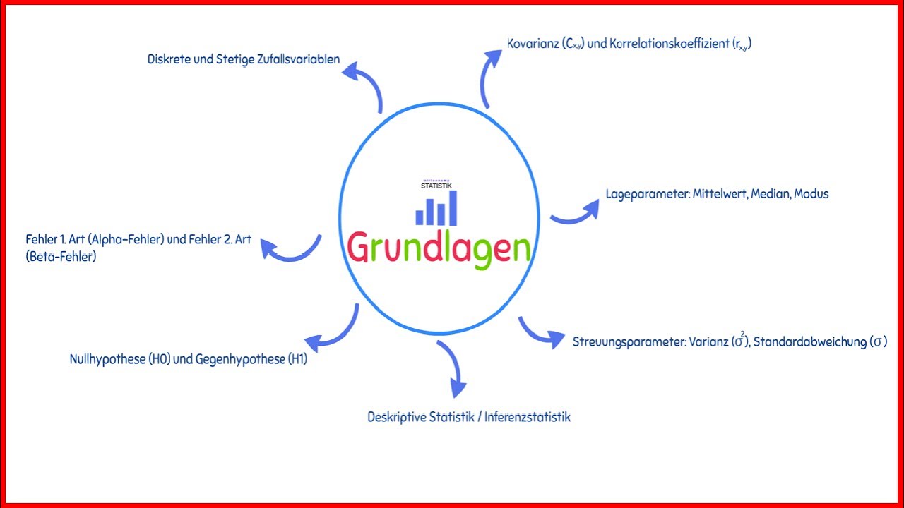
Statistik Grundlagen | Die wichtigsten Themen für deine Klausur 📔✏️ | Übersicht | wirtconomy

20 Self Improvement Tips to Improve Your Personality

Caleb Karuga ; How to become a rich farmer in Kenya

Future of Computing

Wuthering Heights by Emily Brontë | Chapter 12